Introducing a series of dashboards to help customers find what they are looking for.
INTROUnifying a fragmented seller ecosystem
In early 2024, Squarespace was doubling down on a seller strategy. Helping customers selling online.
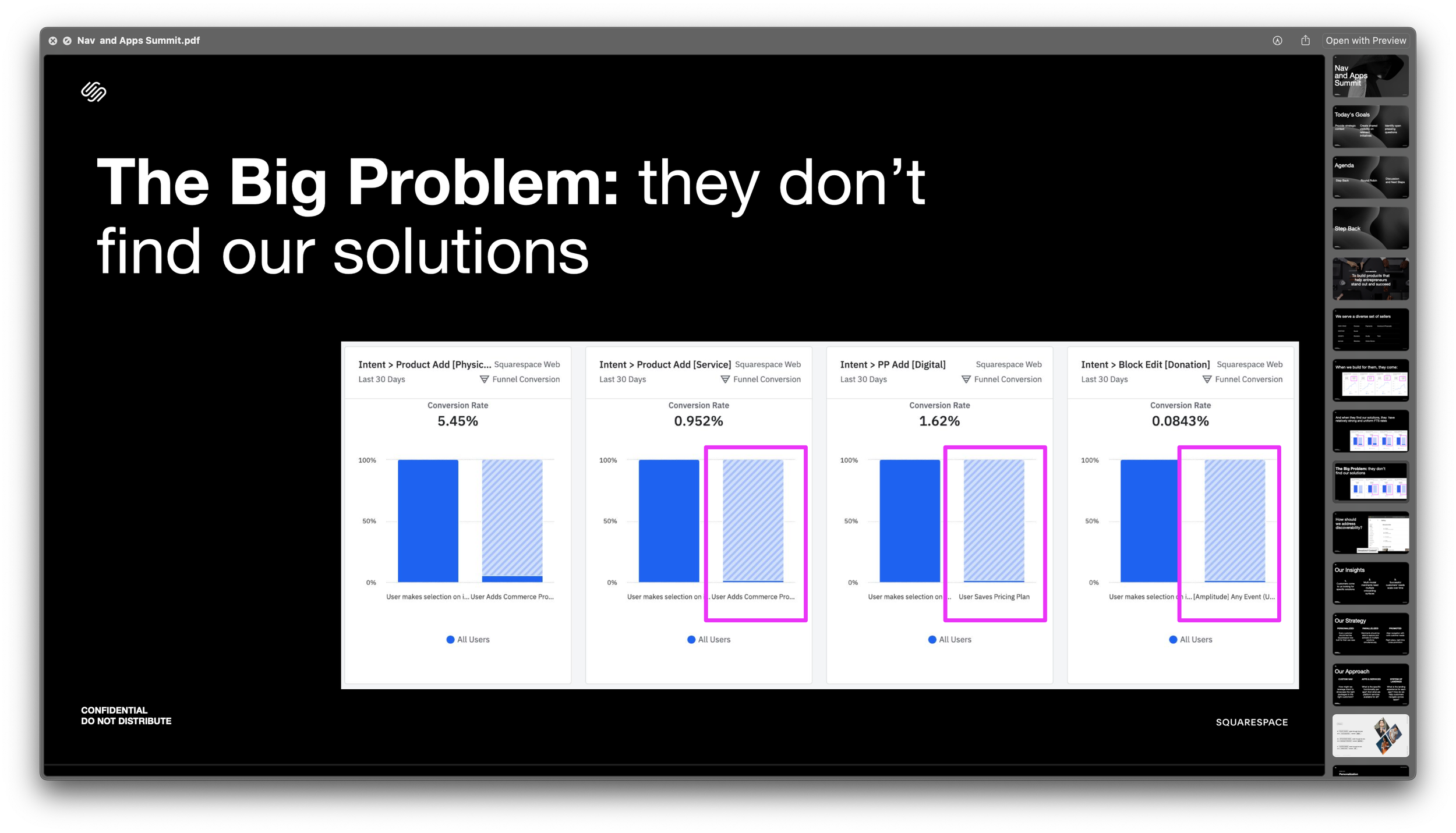
Squarespace saw good activation from physical sellers, but, many sellers offering services or digital goods simply didn’t know those tools existed.
THE OPPORTUNITYAs Squarespace grew, its commerce tools became scattered, with each selling type requiring separate entry points and onboarding.
Just 4 in 10 new sellers found selling features like services or donations.
How might we help users find the right tools for their business type?
MY ROLEAs Design Manager, Activation & Growth, I lead Activation & Growth from concept to launch, uniting activation, onboarding and product architecture.
Strategic Leadership:
Defined activation framework, aligned design/content/product, prioritized work and secured leadership buy-in for Home/Hub vision.
Design Direction:
Directed Home Dashboard design, building modular widgets and adaptive states to evolve with users.
Partnerships:
Collaborated with Creative, Content and PMM on storytelling and GTM use of Home; led co-design sessions with engineering and design teams.
PROCESSA Four-Phase Evolution
Phase 1 — Strategy & Framing
A New Navigation
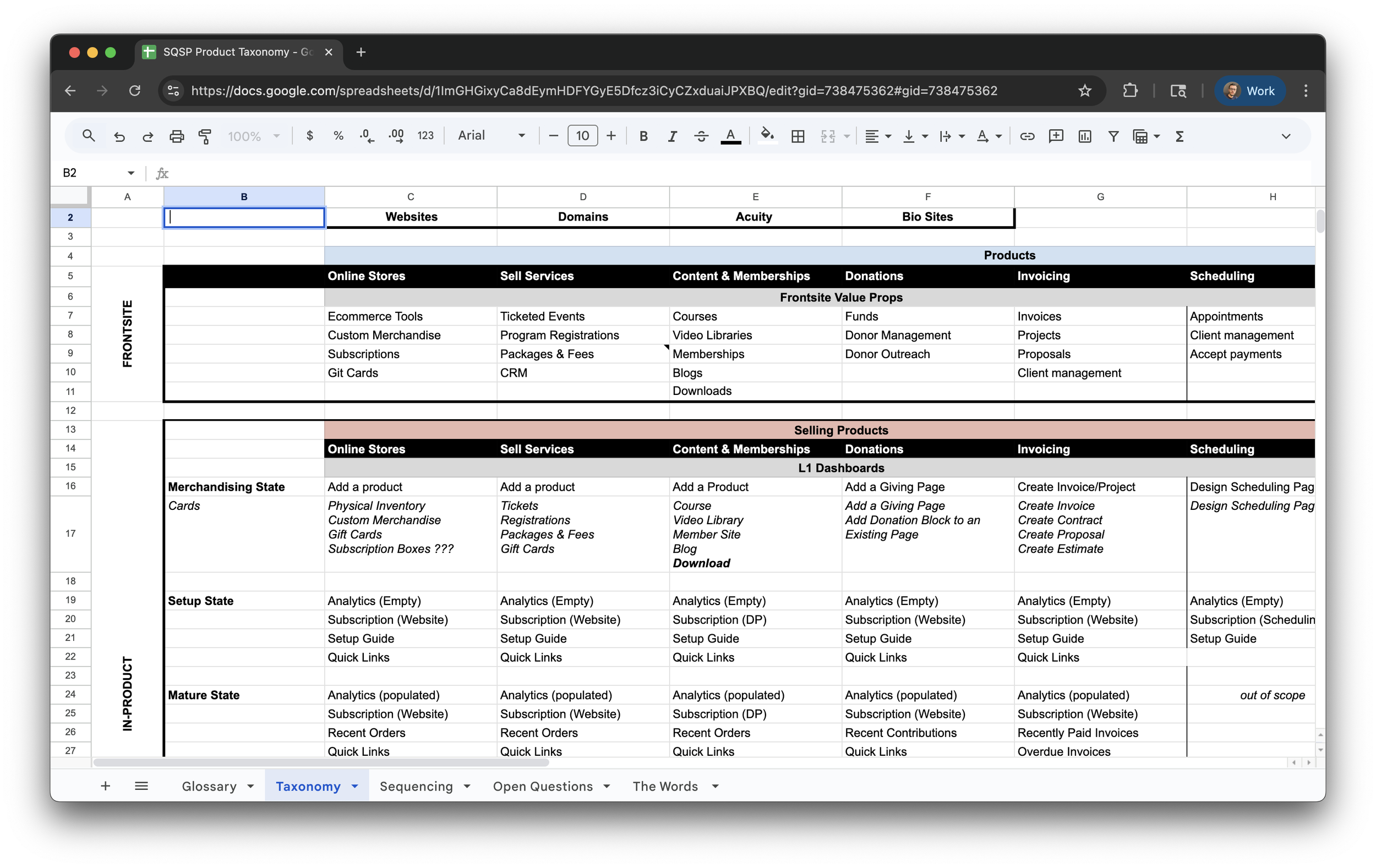
We saw sellers struggle to find or finish setting up core features. We mapped capabilities by selling type (physical, digital, service, donation) to ultimately create a “selling mode” first navigation
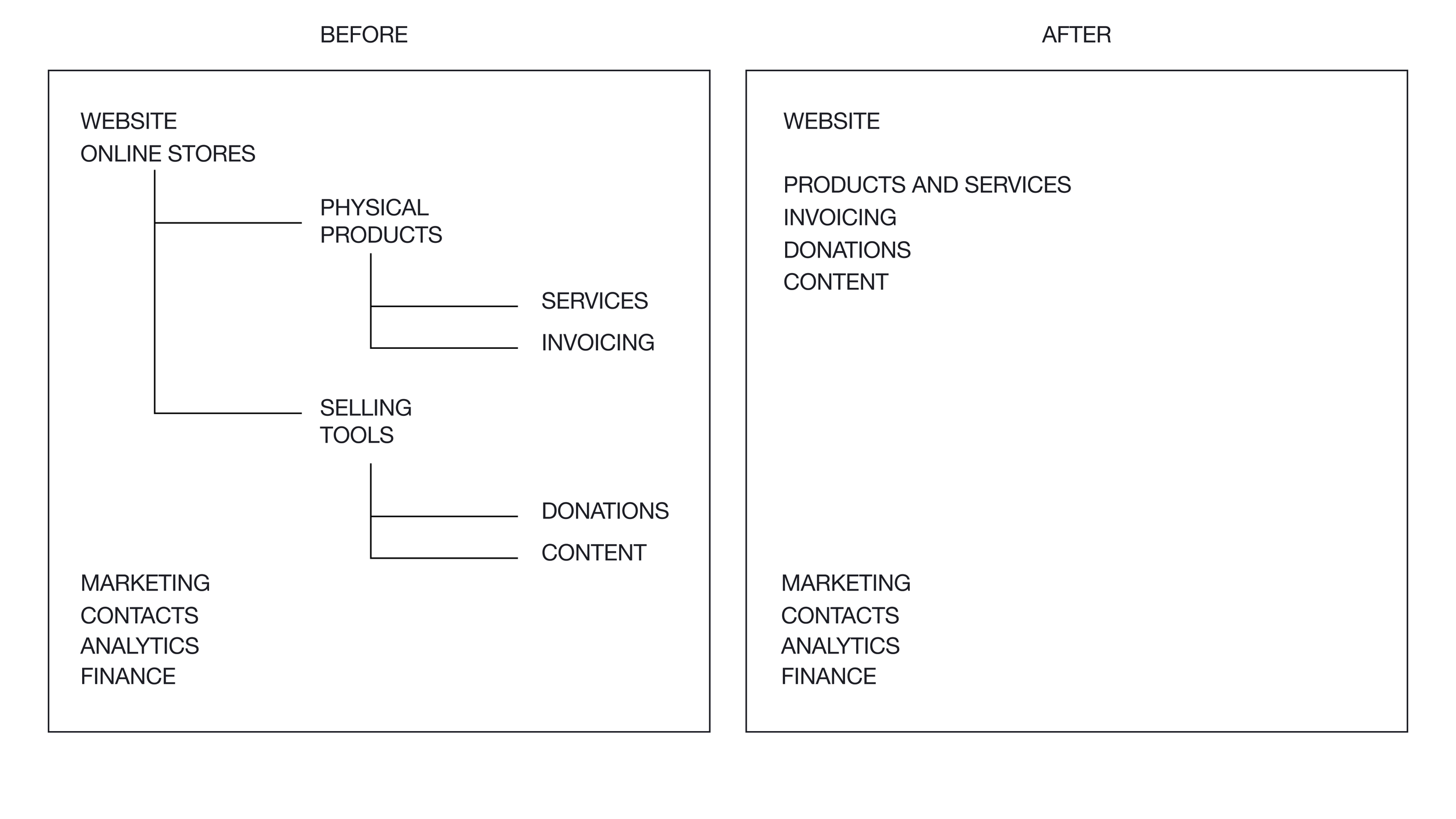
Based on that mapping we proposed a new navigation, one that moved away from a single “Online Store” entry point. And instead introduced selling mode specific menus items.
Secured sponsorship
Given the large implications of these changes we needed to expand the scope of the team and in bringing into the fold folks from various impacted areas. Both feature teams as well as platform teams such as design systems.
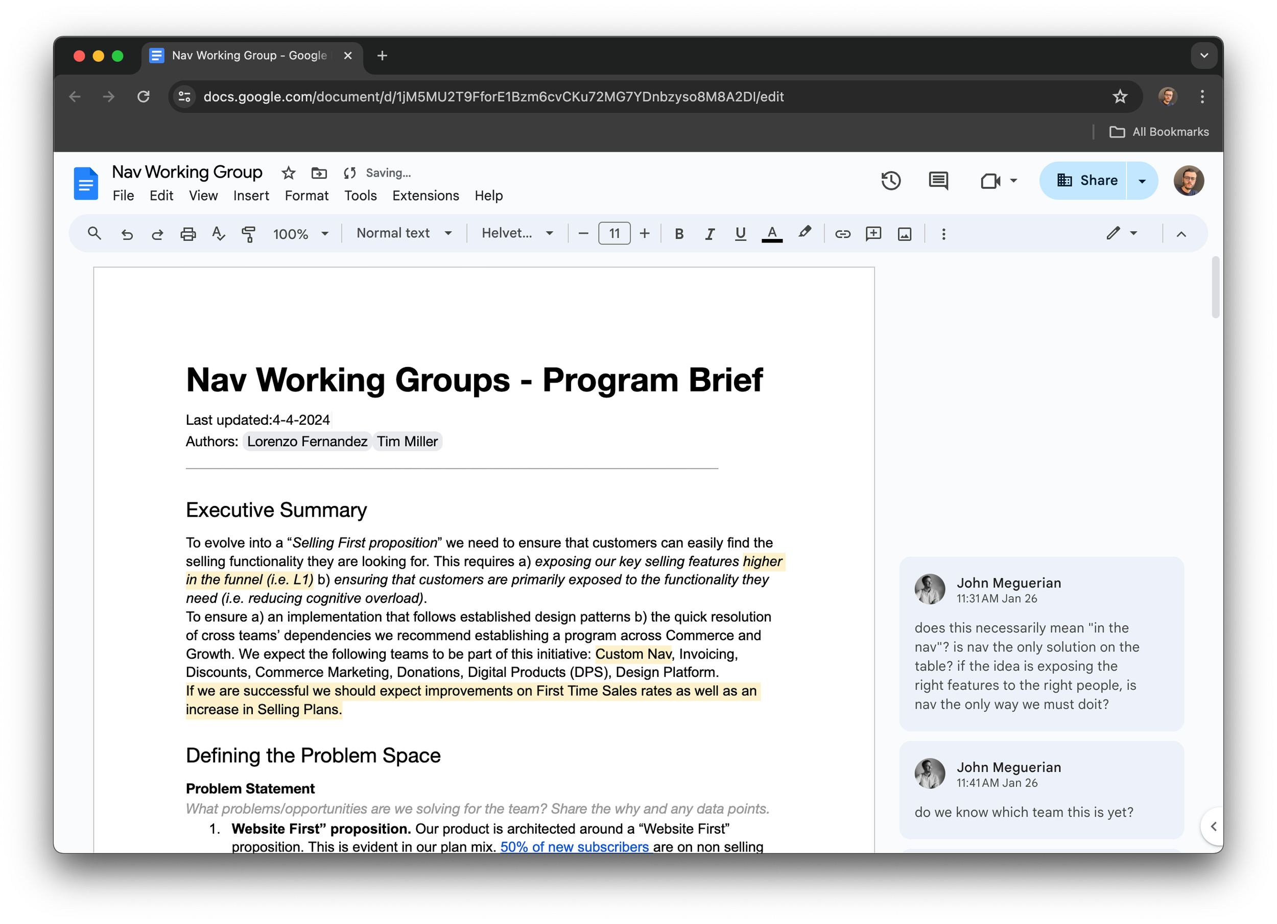
In partnership with product we outlined a series of documents for difference audiences that would make the case for adding more resources to the initiative.

Phase 2 — Team Formation & Scoping
Staffing & ownership
Team Formation & Scoping. The prototyping effort aimed to unify scattered ideas. We defined roles across design and engineering, and reallocated designers to keep momentum.

The prototyping initiative had the intention of creating a single point of view, synthesis of ideas floating across the organization.
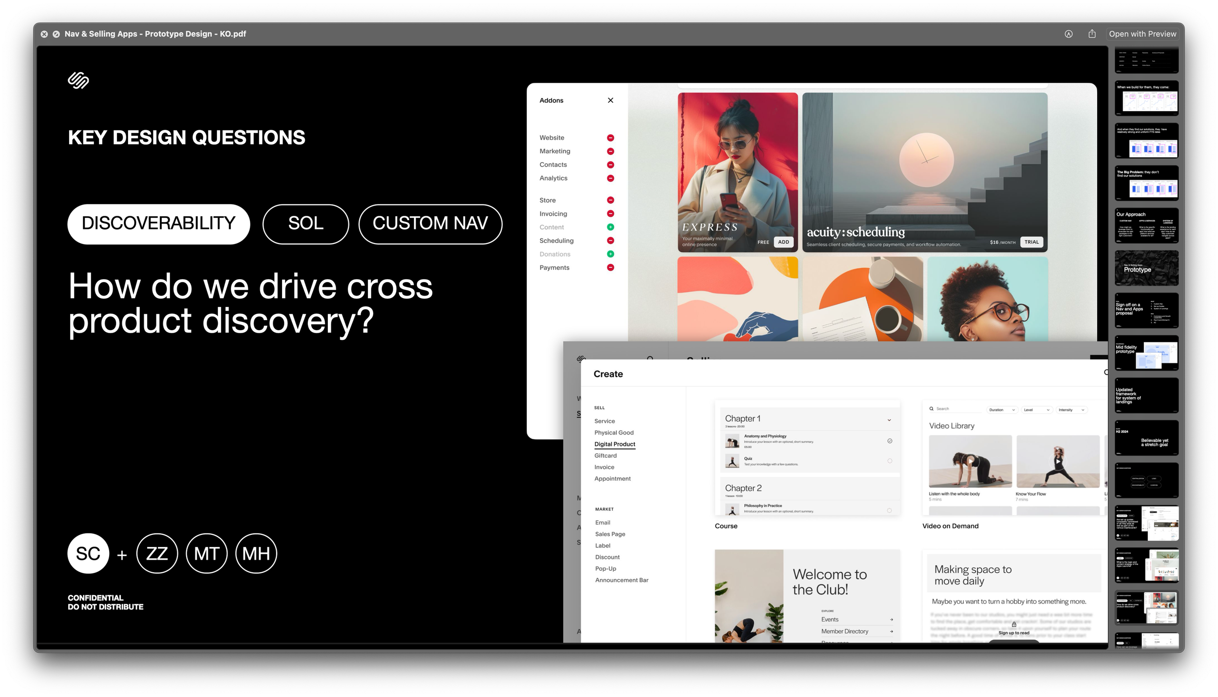
Phase 3 — Framework & Early Prototyping
Defined the Activation Framework
Facilitated leadership readouts
Working closely with content strategy we defined a cohesive approach on how each selling mode landing page, i.e. dashboard would look like.
Given the large organizational impact of these changes we needed to ensure support from leadership. Together with product we prepared a series presentations that would showcase the impact of these changes
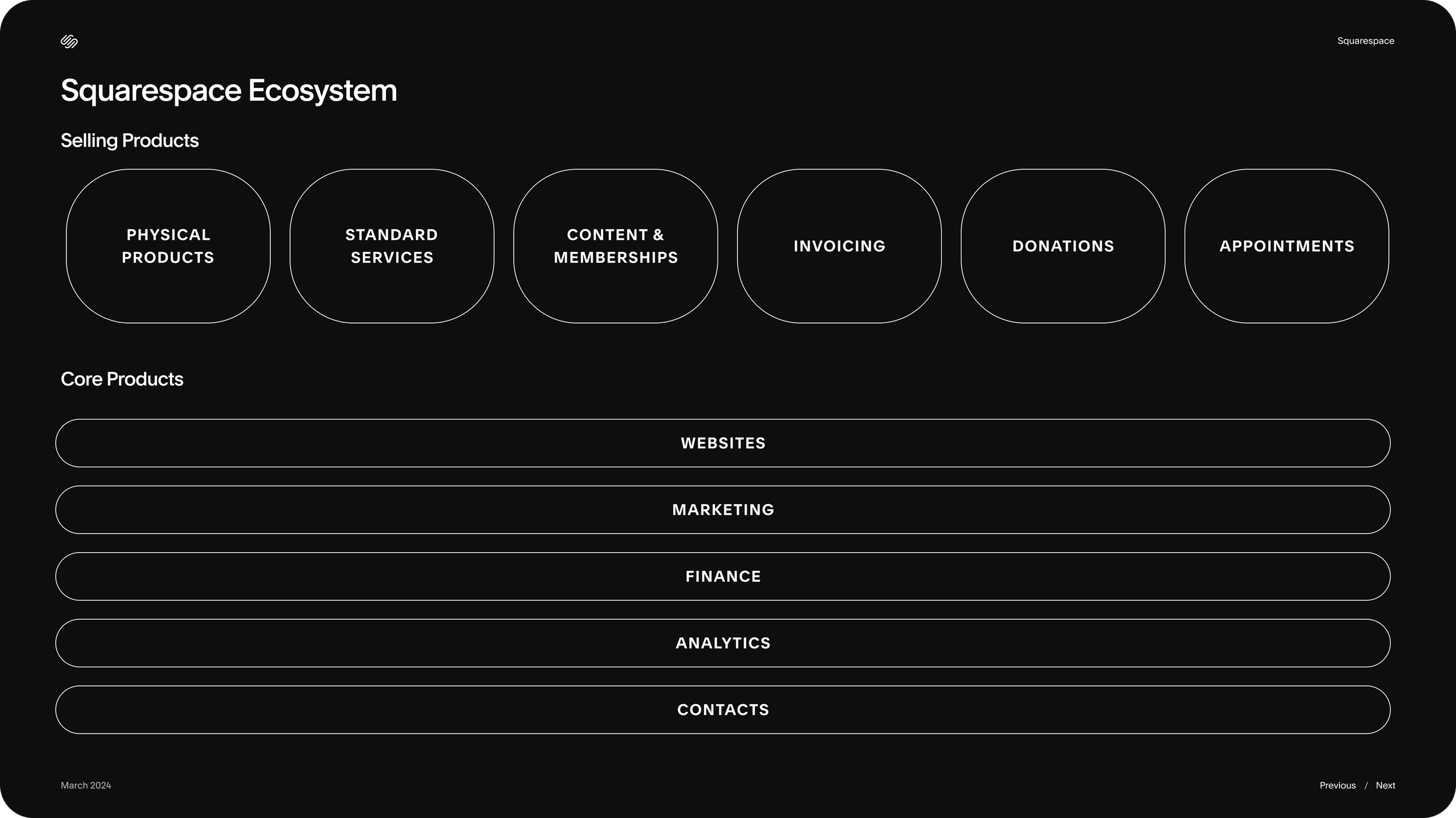
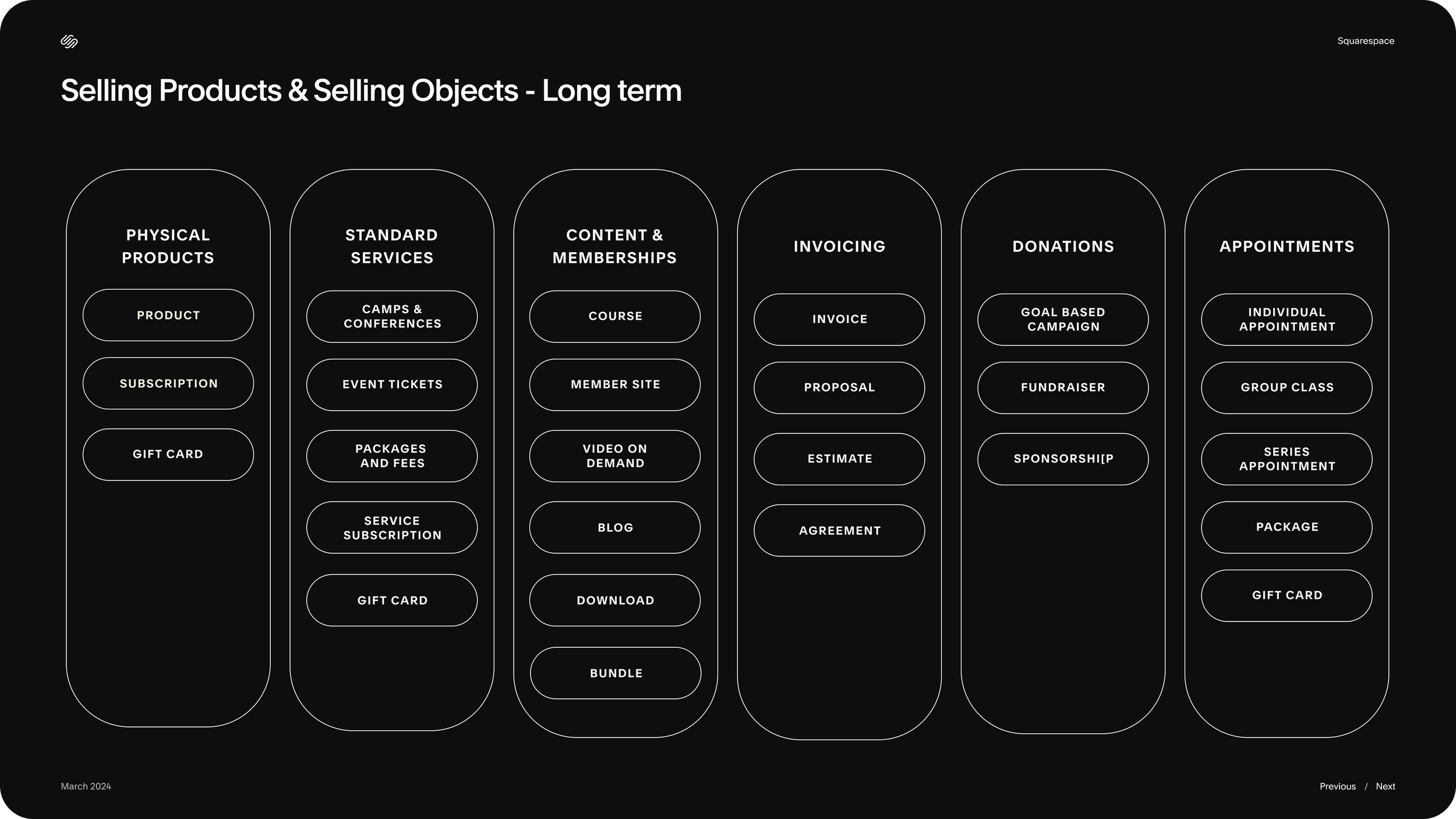
A section of a storyboard the team created in preparation for a prototyping phase
OUTCOME 1
An aligned framework on how to design dashboards across the customer lifecycle.
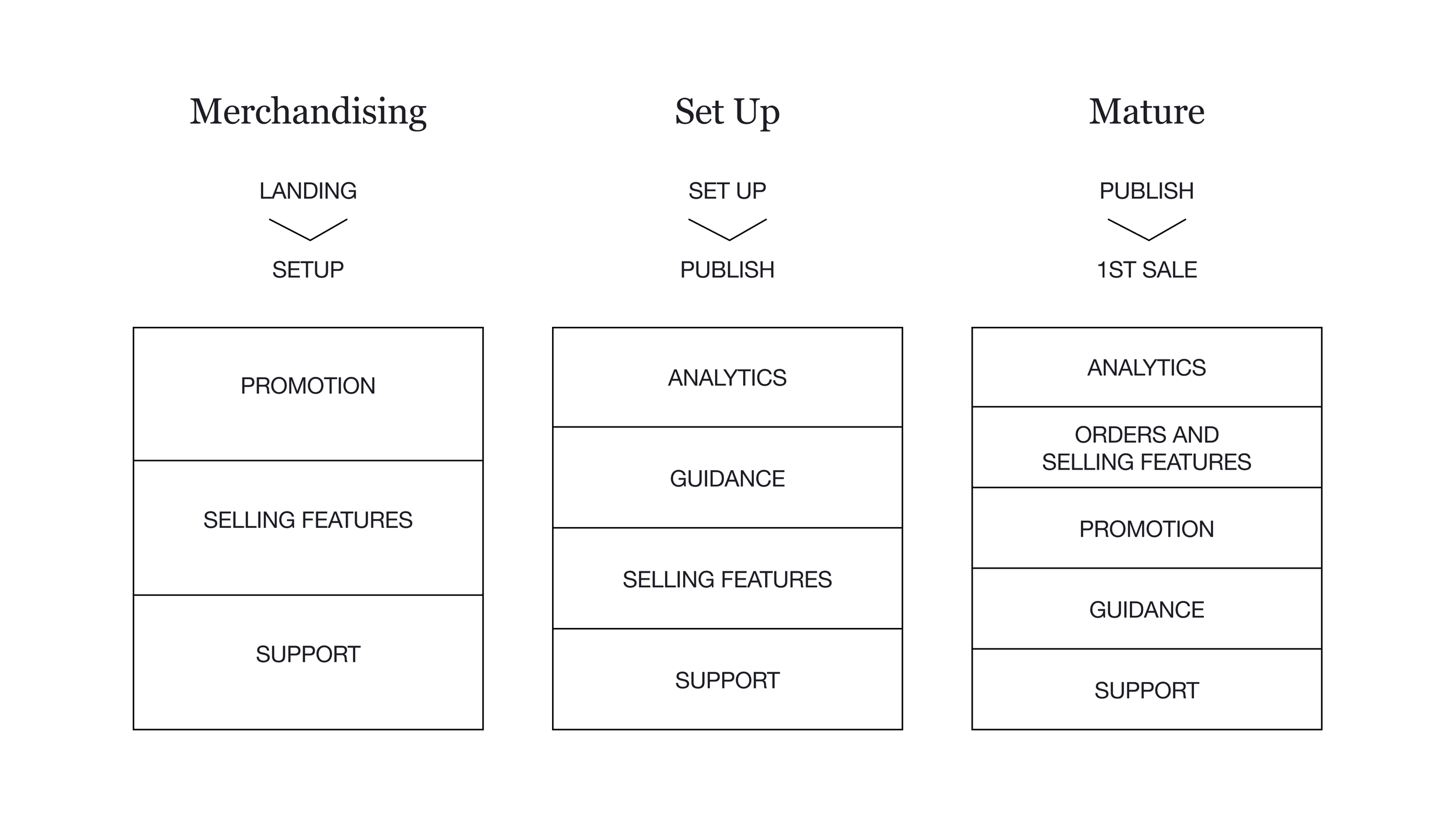
A lifecycle-aware dashboard that adapts to pre-publish, post-publish and post-sale stages, keeping sellers moving from setup to growth.
Phase 4 — Visual & Content Strategy
Led creative exploration
We explored creative ways to smooth the journey from landing to product. We aimed to bridge the expressive language of Squarespace.com with the functional language of the dashboards.
SQUARESPACE.COM - EXPRESSIVE
We launched a visual exploration with key design questions, gathering inspiration and developing competing directions.
IN PRODUCT - FUNCTIONAL
Our was to create a bridge between the visual design of front site and the one in the product experience. With this deck I introduced the idea that our home should become our “Grand Central” a place that balances its way finding function with a sense of awe.
Aligned across organizations
To align across design, feature teams and marketing, we held workshops to gather feedback.
Sessions with Content Localization helped us design assets that translate easily.
A workshop with Product Marketing ensured our formats support in-product communication.
We also reviewed design treatments with brand and marketing to align in-product assets with front site art direction.
OUTCOME 2
The organization aligned on a unified concept that meets requirements and respects art direction.
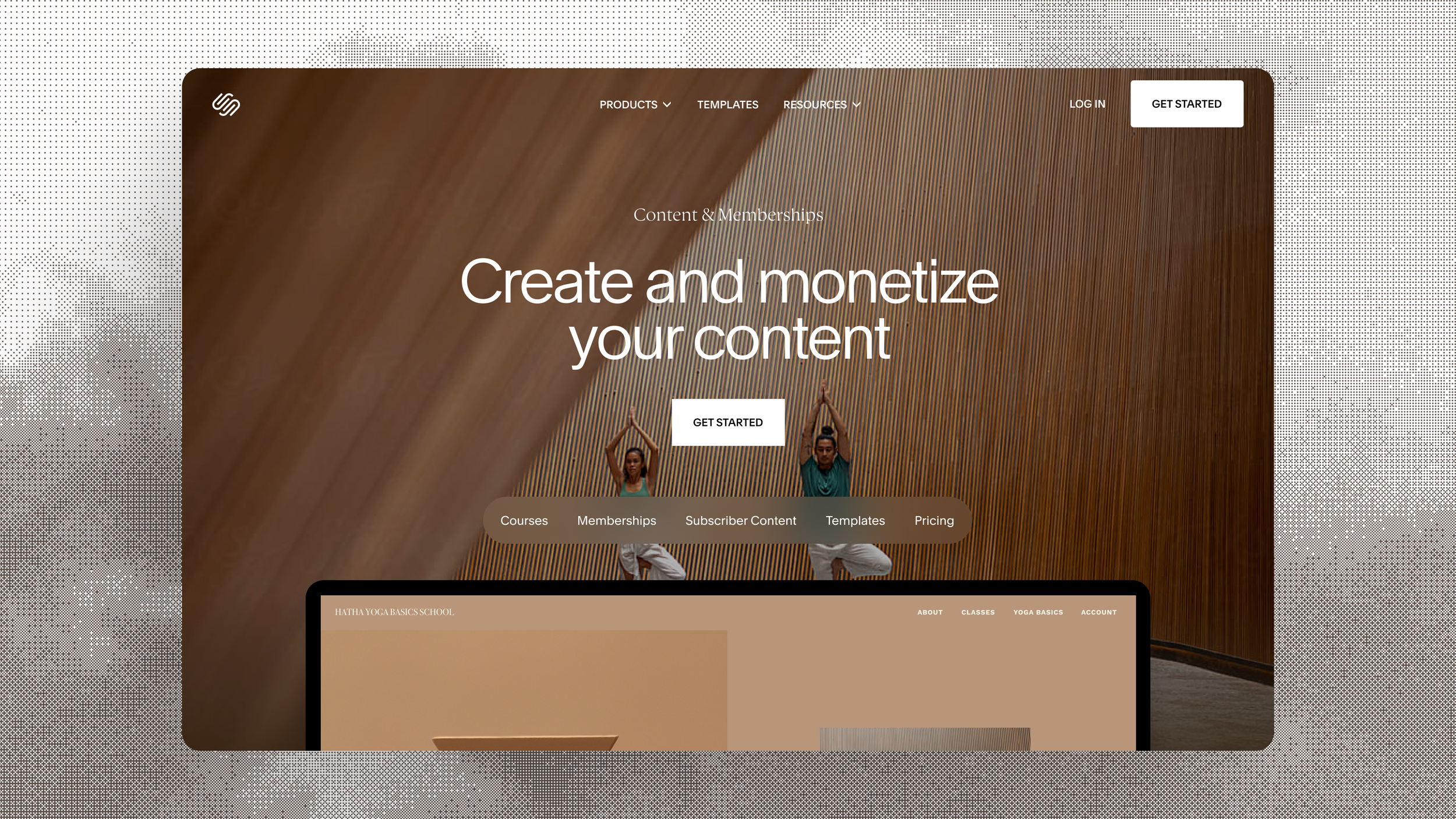
Step 1 - Front Site: Welcome customers with clear language about what we offer.

Step 2 - Merchandising: In product, language and imagery connect the front site to features, showing users what tools suit their needs.

Step 3 - Set Up: After choosing a product type, present clear setup guides outlining the necessary steps.

Step 4 - Mature: For mature sellers, populate analytics to show business performance.
Phase 5 — Launch
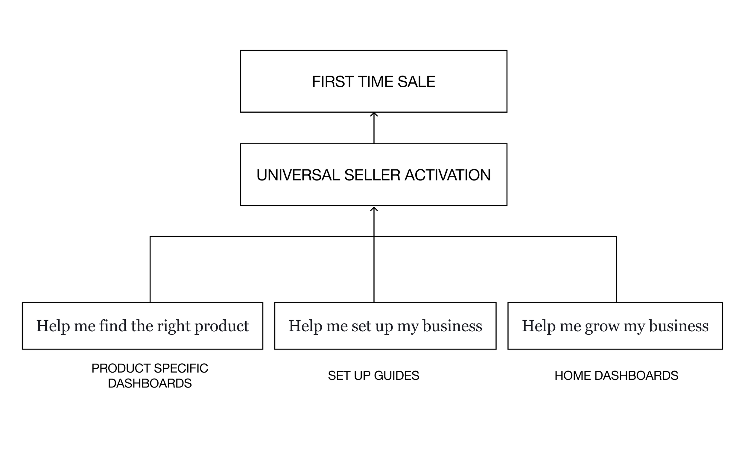
PRODUCT SPECIFIC DASHBOARDS
Help me find the right product
KEY INSIGHT
Navigation had grown confusing; only 42% of new sellers found non-physical tools.
SOLUTION
We redesigned navigation into modular landing groups that direct users to the right tools
IMPACT
8% improvement to Universal Selling Activation
Merchandising Dashboards Across Selling Modes
Mature Dashboards Across Selling Modes
Phase 5 — Launch
SETUP GUIDES
Help me set up my business
KEY INSIGHT
Users stalled after finding tools because they didn't know what to do next.
SOLUTION
We launched contextual Setup Guides tailored to each selling type, surfacing next actions by lifecycle stage.
IMPACT
Setup Guides increased activation by 7–13%
Phase 5 — Launch
HOME DASHBOARD
Help me grow my business
KEY INSIGHT
After launch, they lacked one place to track progress and find growth opportunities.
SOLUTION
We built a dynamic dashboard that adapts as their business matures, integrating setup guides, AI, analytics and marketing tools.